
Part Two: Document Set-Up
One note before we start:
I'm using still Illustrator CS3 throughout on the Mac. Mac keyboard shortcuts can usually be replicated in Windows by substituting CTRL for CMD. Illustrator is the unloved, red-headed stepchild of the CS family, and has changed relatively little since the last version I used which was (I think) V8.0, so most of this stuff should be backwards-compatible. I am currently in transition to CS5 and will note any significant differences in application behaviour as we go along. I’ve never used CS4, so if any readers spot any differences in that version, please post in the Comments section.
First things first. Launch Illustrator (hereafter AI for brevity), and create your document:

The document size should always be the full bleed size of the artwork, unless bleed is specifically prohibited, in which case use the finished page size. Use CMYK for everything except web-comics. Leave the resolution as it is -- you can always reduce the resolution in another application, like Photoshop, but you can't put it back in.
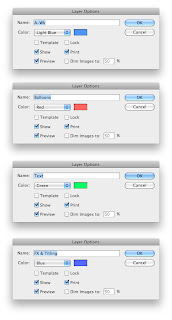
The next thing you need are four layers:
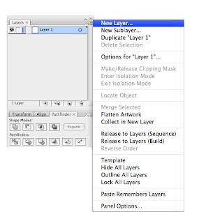
(Note that there are essentially two schools of thought where layers are concerned: this one and the method advocated by, among others, Comicraft. The other method involves having multiple layers for each balloon, each layer holding stroke or fill to allow for easier editing. Whilst I understand that if you are already familiar and comfortable with this method, it probably works very well for you, but it dates from earlier versions of Illustrator that merged balloons and tails in a non-editable manner. It’s unnecessarily complicated if you are learning lettering from scratch using a reasonably current version of AI.)
AI automatically defaults its ruler origin points to bottom left of document. There are excellent historical reasons for this that relate to the mysteries of Postscript code and the earliest days of WYSIWYG DTP, but when every other application in the world uses top left it’s still pretty annoying. Reset it by clicking in the corner of the rulers and then dragging to the top left corner of the document:

If you're self-publishing, you'll need to ask your printer for the following information, otherwise your editor will be able to tell you ...
You need to know the Bleed, Trim and Live (Safe Type) areas. As briefly as possible, the bleed is the outer edge of the artwork, to which anything that's meant to bleed off the page needs to be drawn. Trim is the finished page size, and Live is the area inside which anything that needs NOT to be chopped off during print finishing goes.
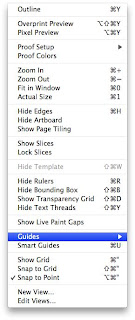
You can either drag guides onto the artwork layer from the rulers to mark these up, or position rectangles on the document and turn them into guides from the View menu:
You end up with something like this:

Lastly, draw a rectangle over the whole of the document area ... don't try this by eye, use the measurements palette at the top of the screen:

Then turn the rectangle into a Crop Area:


This means that you can place any useful items you want -- pasted text, pre-prepared speech balloons and the like -- outside the artwork area and they'll automatically be excluded when you export the finished, lettered page as a TIFF, EPS, or whatever the editor/printer wants.
IMPORTANT NOTE:
With CS5, Crop Areas are history. In one respect, this is easily worked around. If you are exporting complete, finished pages with lettering and art combined, then you can simply check the “Use Artboard” option to achieve the same result.

Some publishers will want you to submit EPS or PDF files without artwork so that these can be married up with the high-resolution artwork by their production department, using InDesign or Quark Xpress. When you previously saved an EPS file, the Crop Area meant that the transparent background of the EPS was the same size as the document -- unless you check the “Use Artboard” option when saving your EPS file, this will no longer be the case and lining up the lettering and artwork will be problematic.
Dependent upon differing versions of software, there may still be problems generating an EPS or PDF file that places reliably. In such cases, try creating a rectangle object covering the document area exactly and then set both Stroke and Fill to None.
Now you have your document set up to your publisher’s specifications, it might be wise to save it as an Illustrator template and call it PUBLISHER_NAME_SINGLE_INTERIOR_PAGE or something equally logical.
This would seem to be a good point to mention double page spreads.
It’s a very common mistake to assume that a double page spread (DPS) is simply two single pages stuck together. It isn’t… not quite.
When you create a single page document, you allow bleed on all four sides. Strictly speaking, this isn’t correct because the page will be printed as part of a pair and either the left or the right edge will actually be joined to the corresponding opposite page at the centre fold, and thus not trimmed at all.
However, since you don’t know for certain whether a given page will be a left- or a right-hand page, you allow bleed on all four sides, and this is corrected when the book is made up for final print output.
With a DPS, though, you know that the first page must be a left and the second a right, so you have to remove the right hand bleed on the first (left) page of the spread and left hand bleed on the second (right) page.
So, if your single page template is, say, A4 with 3mm bleed, your single page template measures 216x303mm (210mm plus 3mm left plus 3mm right x 297mm plus 3mm top plus 3mm bottom).
A DPS would measure 426x303mm (420mm plus 3mm left plus 3mm right x 297 plus 3mm top plus 3mm bottom).
I find it useful to drop a guide on the document’s centre line, to show where the fold will occur. From this, it’s very easy to see where your Safe Type/Live areas should go.

Once you have your page set up as a template, you need to save down a file for your working document. If you open your template, you should get an Untitled Document… save it as something logical like BOOKNAME_ISSUE#_LETT_001.
You can now import the artwork.
Make sure you have the Artwork Layer selected in the palette:

And then place your artwork (you'll need to hit CMD-0 (zero) to centre your view in order for the artwork to place where you expect it) from the File menu:

Finally, remember to lock this layer, because you don't want to mess with it from now on:

You're now ready to start setting type ... which, fortunately, will be the subject of Part Three.
Woah, that is really updated from the last time I saw it. Good work Jim.
ReplyDeleteThanks, Bolt! Sorry I'm not going to make it to the Wellington tonight, but I'll come and find you at the Con tomorrow. :-)
ReplyDeleteAny chance you could post the save file for your single and double page templates?
ReplyDeleteCheers.
Awesome blog by the way.
I don't know about CS5, Jim, but in the CS6 the "crop areas" are called "Create Trim Marks"...
ReplyDelete